Natasha Higgins talks to Sophie Patterson as we go in search of interior design hints and tips.
Who is Sophie Patterson?
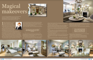
I am an interior designer, working predominantly in London on high end residential properties. I undertake entire house renovations and generally we are involved from the very beginning where we can advise on space planning, lighting and interior architecture to ensure the refurbishment results in a functional as well as beautiful space.
What key points should people remember when it comes to interior designing a property?
Just because a colour is called the same name doesn’t mean it is the same- don’t assume because you have taupe curtains that these will automatically tone well with your taupe sofa. What one manufacturer may call taupe, another may call grey. Always test out fabric and finishes in the room you plan on using them in. Lighting can completely change the colour of a paint, wallpaper or fabric so the best way to ensure you like what you get is to see a sample of the paint on the wall or look at a fabric in the room at different times of the day.
One of my favourite tips to avoid an overly contrived interior is to include one piece that is different from the rest of the furnishings in the room. If you have all contemporary furniture include one antique chair for example, upholstered in a contemporary fabric to tie it in with the rest of the scheme. A touch of leopard skin print on a cushion or a piece of modern art in a traditional room will make it look current and inject character into the room. Also don’t forget to dress your space with knick-knacks, lots of photo frames, candles, books, throws on a sofa, paintings, sculptures, vases, plants, flowers. Often people stop decorating far too soon and it’s these finishing touches that can elevate a space from a ‘nice’ house to a spectacular, glamorous home.
What are your favourite colour schemes and how do they work best?
Currently I’m loving deep red velvets next to grey cashmere and suede. I also currently am obsessed by and designing schemes including accents of turquoise, orange, navy blue and purple but not all together! I’ll always stay true to my mantra of less is more and not throwing colour at everything but colour is a powerful tool, especially on a limited budget to create impact and interest, if done in the right way.
What’s the most interesting project you’ve worked on?
Purely by coincidence I am currently redesigning my second home that previously belonged to David Bowie. Both properties were in The Borough of Chelsea and Kensington and were lived in by David Bowie in the 70s and 80s! The current property’s interior was apparently painted entirely black from basement to attic by Bowie whilst he lived there as he wanted to understand what it was like for the miners to be in total darkness during the miner strikes. I’m glad to say the scheme we are going for is a little more luxurious and uplifting than its previous state!